Content


Team Lead of Content for promodo.com
Experienced in working with data, expert recommendations, and real business cases to create clear and valuable content that delivers real business impact. Passionate about discovering new insights, exploring industry trends, and turning complex topics into practical, easy-to-understand content.

Head of UX/UI Promodo
I have over 8 years of experience in designing CRM and HRM systems, eCommerce, landing pages, and mobile applications. As a UX/UI designer, I develop strategies and innovative design solutions that help improve user experience and result in positive changes in key business metrics. As a mentor, I teach new designers how to create innovative and well-reasoned design solutions, share my experience, and help them avoid mistakes in interface design.
Between 35–50% of a website’s conversions depend on the quality of its UX/UI. And every project we work with proves it. Earlier, we covered the most common design mistakes that hurt sales. Now it’s time to talk about the solutions worth implementing.
In this article, we’ve described what are the latest trends in UX/UI design for 2026 and illustrated how they work in practice.
There’s no way around AI in 2026. But adopting AI for the sake of appearances makes no sense. Interfaces should guide, assist, and automate routine actions — improving both the speed and accuracy of user interactions.
For example, in the Google web browser, users can receive AI-powered contextual tips while browsing — from page summaries to suggestions for next steps.
These AI capabilities reshape how people interact with interfaces and noticeably reduce cognitive load. At the same time, brands can keep the design their audience is used to: classic UI enriched with intelligent hints that don’t break familiar behavior patterns but subtly enhance them.
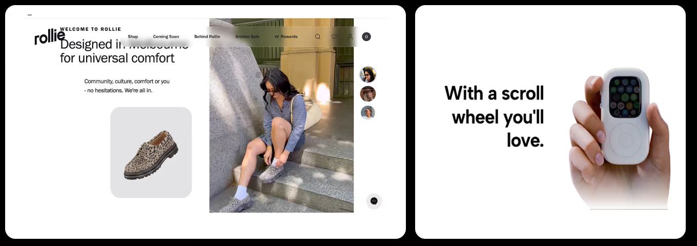
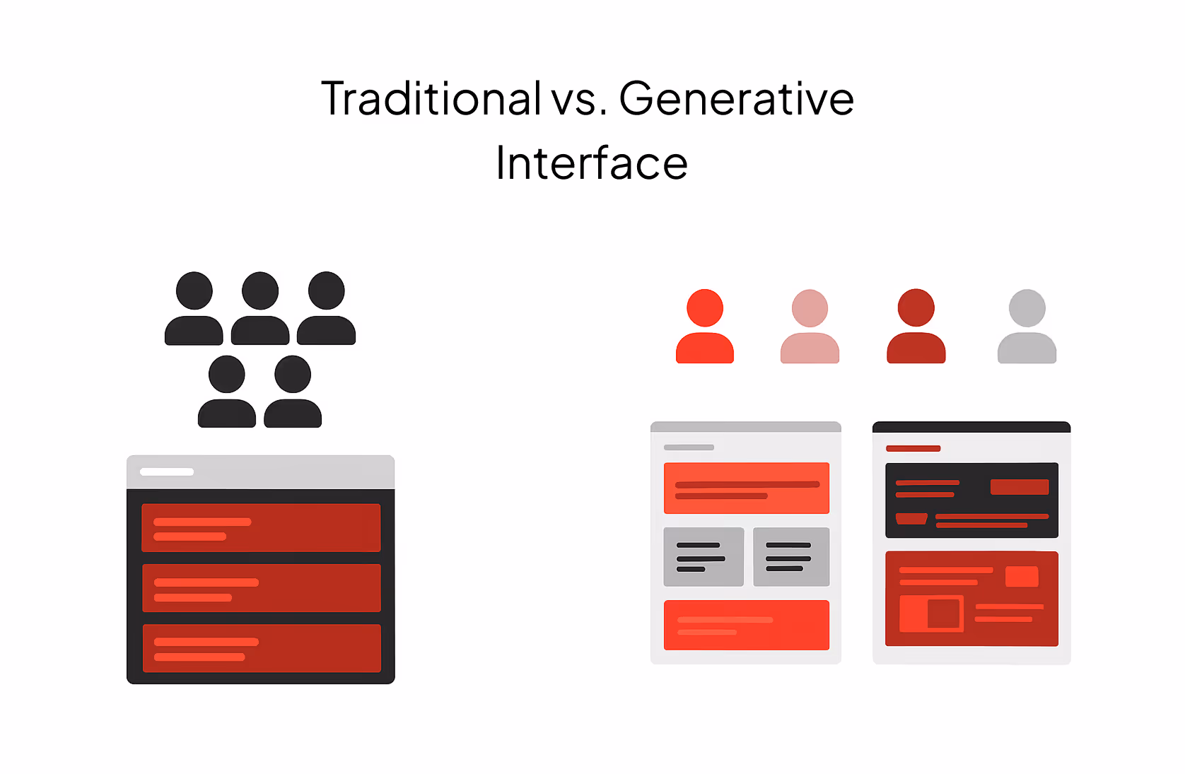
Modern digital products are moving away from the “one interface for everyone” approach and shifting toward models where the UI adapts dynamically to each user’s context.
Generative UI is a new interaction model in which AI doesn’t just generate text or content — it creates a fully dynamic interface based on any user request.
The focus is no longer a fixed page template but a system that builds its structure depending on user intent, past actions, segment, and real-time context. This approach reduces unnecessary cognitive load and shows only what matters in the moment — relevant filters, the right category priority, or a CTA aligned with the user’s actual goal.
A generative interface still operates within predefined guardrails, but it enables much faster decision-making than static pages. This opens the door to design systems that adapt to different behavior patterns instead of producing dozens of fixed layouts for every scenario.
In 2026, when producing large volumes of content is easier than ever, it’s the expert, concise, human text that becomes a core driver of trust.
Short, precise messages written in the brand’s tone, attention to the user’s emotional state, and a touch of well-placed light humor — all of this shapes a positive interaction experience. Interface language should feel human, simple, and contextual. It should guide the user, not distract them.
The principle of micro-commitments has been well documented in behavioral psychology, particularly in Robert Cialdini’s “Foot-in-the-Door” theory: once a person takes a small action, they’re far more likely to complete a bigger one.
When the interaction starts with a simple, low-pressure step — “choose a parameter,” “where should we start?”, “what’s your budget?” — users are 2–3 times more likely to reach the final CTA. Quizzes, product finders, and lightweight interactive flows often deliver up to a 45% increase in conversions compared to pages without such micro-interactions.
The reason is simple: the first “easy” step triggers an internal drive to finish what’s been started. Instead of drowning in a huge catalog or an overwhelming choice, the user feels guided through a dialogue with gradually narrowing options. A post-quiz recommendation is perceived not as an ad but as a personalized suggestion — which is why CTA clicks and add-to-cart actions grow.
In 2024–2025, businesses began moving away from traditional banner carousels toward layouts where several banners are displayed on the screen at once. Research shows that only about 1% of visitors click on carousel slides at all. And within that 1%, a five-slide carousel gives 89% of all clicks to the first slide.
This is why multi-banner screens — the so-called bento grid — remain a major UX/UI design trend 2026.
A Bento Grid is a modular layout where content is arranged in blocks of different sizes and shapes, similar to a Japanese bento lunchbox.
This layout helps visually organize large amounts of information and creates a dynamic rhythm on the page.
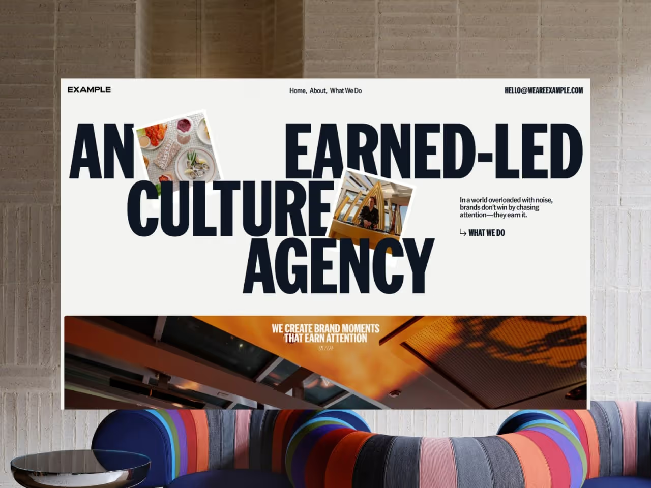
Modern websites increasingly blend text directly into the visual composition. On the Example agency’s website, this UX/UI trend appears in large headlines that interact with the photography — the text partially overlaps or frames the images.
This approach adds movement and a sense of a “living” layout while reinforcing the brand’s character.
The UX UI trend for translucent, “glass-like” interfaces is returning to the spotlight, especially after Apple’s 2025 redesign, where this style became central to the visual system.
Glassmorphism is a design approach built on backdrop blur, semi-transparent layers, and contrasting outlines. It creates visual hierarchy through “glass” cards that appear to float above the background.
This style adds depth and lightness, blending minimalism with expressive visuals. It’s used to improve content hierarchy, direct user attention, and convey a modern, polished feel without overwhelming the interface.
A Voice User Interface lets users control a system with their voice instead of clicks or taps. This makes interaction faster, more natural, and convenient even without a screen.
Starbucks has long used its Starbucks Voice Ordering system, allowing users to simply say, “Order my usual coffee,” and the app automatically finds their favorite drink and places the order — no screen taps, just a single voice command.
Why businesses should pay attention to this modern UX/UI design trend in 2026:
Despite its visual appeal, parallax effects can quickly cross the line from “wow” to harming the user experience. To avoid that, it’s worth following a few principles:
It’s not a new idea, but it remains highly relevant in 2026. Why? Because nothing builds trust as effectively as real people showing how they use a product — honestly, naturally, without staged shots.
UGC keeps working not because it’s a “latest UX/UI trend,” but because it creates the shortest path to emotional connection with the audience. Users want to see real experiences, not flawless renders: how a product looks in someone’s hands, in a room, on the go, in everyday life.
That’s why brands that integrate UGC into key sections of their websites see higher CTRs, longer sessions, and better conversion rates.
Users are becoming increasingly aware of how digital products impact the environment. That’s why in 2026, designers should focus on energy-efficient and “clean” interfaces — fewer unnecessary animations, lighter file sizes, and fast-loading pages.
These choices not only improve the performance of websites and apps but also reduce their digital footprint — from server load to the amount of energy consumed on users’ devices.
If you’re still unsure which UX/UI trends are worth implementing on your website, reach out to the Promodo team. We have extensive experience with modern design approaches, test solutions on real projects, and apply only those tools that will deliver measurable results for your business.

Team Lead of Content for promodo.com
Experienced in working with data, expert recommendations, and real business cases to create clear and valuable content that delivers real business impact. Passionate about discovering new insights, exploring industry trends, and turning complex topics into practical, easy-to-understand content.
Head of UX/UI Promodo
I have over 8 years of experience in designing CRM and HRM systems, eCommerce, landing pages, and mobile applications. As a UX/UI designer, I develop strategies and innovative design solutions that help improve user experience and result in positive changes in key business metrics. As a mentor, I teach new designers how to create innovative and well-reasoned design solutions, share my experience, and help them avoid mistakes in interface design.
You may also like
Choose quality and trusted services to improve the presence of your company on the Internet, and feel free to contact our UK team if you have any questions.

Prepare your website for Black Friday & Cyber Week with these 9 SEO tips. Drive traffic, increase conversions, and maximize your holiday sales.

How can a Q&A platform relate to marketing? In an indirect yet highly effective way. Here is what Quora digital marketing is all about.

Choosing the right team for your digital marketing efforts is no easy task, especially if you have no substantive knowledge in promoting an online store.
We at Promodo are ready to help you improve your performance across all digital marketing channels.
Get started


.avif)