


Asaxiy is a leading online store in Uzbekistan with a wide range of electronics, gadgets, and books.
The client approached us with a critical business problem: the growth of key conversion metrics had stalled, and performance indicators lagged significantly behind market competitors, falling well below global industry averages.
By the way, we’ve already worked with Asaxiy on improving their technical SEO. You can find all the details in our case study.
.png)
Preliminary diagnostics revealed that the core of the issue was the mobile version of the site. Although it was the primary source of traffic, it showed the highest rate of customer drop-offs. The client’s request was focused on tangible business results: to conduct a deep analysis to identify the reasons for customer attrition and to develop a strategy to increase conversion rates—and, consequently, the company’s revenue.
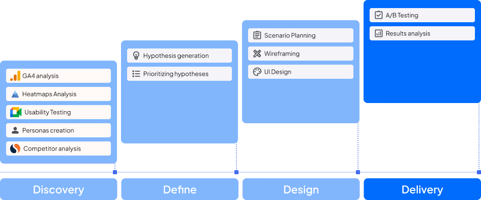
Our work began with a comprehensive research phase to form a holistic view of the project. We conducted a detailed analysis of the competitive landscape to identify market standards, followed by an in-depth audit of the product itself, including an expert review of over 800 interface elements.
At the same time, we analyzed quantitative data from Google Analytics to identify funnel bottlenecks and studied behavioral patterns using heatmaps and session recordings in Clarity.
To complement these insights with qualitative understanding of audience motivations and barriers, we conducted a series of moderated usability tests. All generated hypotheses were carefully filtered using an Impact/Effort matrix, allowing us to focus resources on solutions with the highest potential business impact while requiring relatively low implementation effort.

A deep analysis of the early stages of the sales funnel revealed issues with user engagement on catalog pages. The Product Page View Rate averaged only 42%, significantly below the industry standard of 50–55% for this niche. This indicated that users were not receiving enough information or motivation from product listings to continue exploring individual products.
Analysis of the key conversion stage—moving from the product page to the cart—revealed substantial potential customer losses. The Add to Cart Rate was just 4.5%, nearly half the industry average of 8–10%. Such low conversion at this stage suggested issues with product trust or unclear purchase conditions, such as insufficient information about shipping and returns.
User behavior analysis at the cart and checkout stage confirmed significant obstacles. The Checkout Completion Rate was only 22%, indicating an overly complex process and likely lack of transparency regarding final costs and a cumbersome order form. Meanwhile, the Cart Abandonment Rate reached 82%, well above the industry average of around 68–70%.

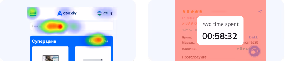
Analysis of heatmaps on the homepage showed that user attention was scattered across banners, while the main navigation categories received few clicks. Session recordings confirmed that many users, failing to find an obvious path, went straight to the search function, ignoring the site’s suggested structure.
Heatmaps and session recordings revealed that users interacted actively with product images but rarely scrolled down to the specifications and reviews sections. This indicated that visual appeal alone did not translate into purchase interest.
Session recordings identified a common behavior pattern among users who abandoned their carts. After reviewing the order contents, their interactions with the interface became erratic: cursor movements turned chaotic or slowly drifted toward the site logo. These aimless actions are a clear indicator of indecision, which often precedes cart abandonment.
To complement quantitative analysis with real insights into user motivations, needs, and barriers, we conducted a series of moderated usability tests and in-depth user interviews.
Participants performed tasks across three key scenarios:
Scenario 1 Issues
Scenario 2 Issues
Scenario 3 Issues
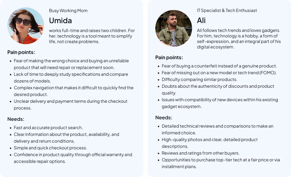
Based on the results of usability testing and in-depth interviews, we created two user personas representing real needs and pain points related to selecting and using consumer electronics and household appliances. These insights helped us tailor solutions to actual user interaction scenarios.
To understand the market context and best practices, we conducted a competitive analysis of key eCommerce players in Uzbekistan, comparing their UI/UX solutions and marketing strategies with Asaxiy.uz. We focused on the leading direct competitors: Elmakon.uz, Olcha.uz, Mediapark.uz, and Openshop.uz.
Our analysis had two main objectives:
Key Findings:
Beyond analyzing direct competitors, we expanded our research to understand two levels of context: globally recognized eCommerce standards and unique solutions specific to the electronics niche. This approach allowed us to combine universal usability principles with the emotional needs of Asaxiy’s customers.
We identified several key practices that represent the “gold standard” for any successful online store:
Niche Solutions: Electronics Market Specifics
Based on our research, we formulated over 40 product hypotheses aimed at improving overall conversion rates. All ideas were prioritized using the RICE methodology, and the most valuable hypotheses were tested through A/B experiments to accurately measure their impact.
The results showed that 46% of the tested hypotheses were successful. This approach enabled us to make data-driven decisions and systematically improve the site’s performance.
Having a fixed “Place Order” CTA button will improve the overall conversion rate (CR).
.avif)
.avif)
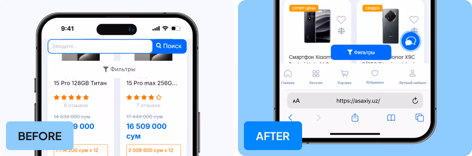
Reorganizing the product page architecture and properly prioritizing key elements will help guide user attention, direct them toward the desired action, and increase both Product Page View Rate and Add to Cart Rate.
.avif)
.avif)
Highlighting the “Filters” button, adding an indicator for selected filters, and placing it in an easily accessible area will improve the user experience, help users find the desired product, and ultimately increase both Product Page View Rate and Add to Cart Rate.
%20%D0%BA%D0%BE%D0%BF%D1%96%D1%8F.avif)
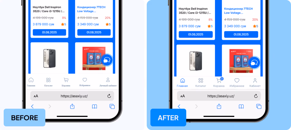
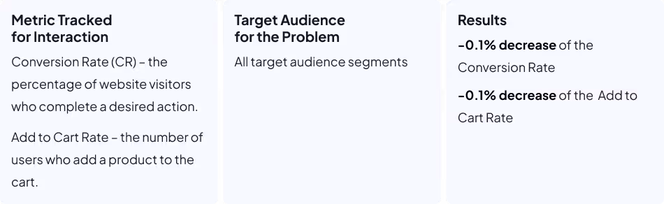
Reducing the height of the tab bar, highlighting the active tab with an accent color, and adding an indicator showing the number of items in the cart would improve navigation and overall usability, which was expected to have a positive impact on conversion.
.avif)
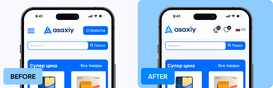
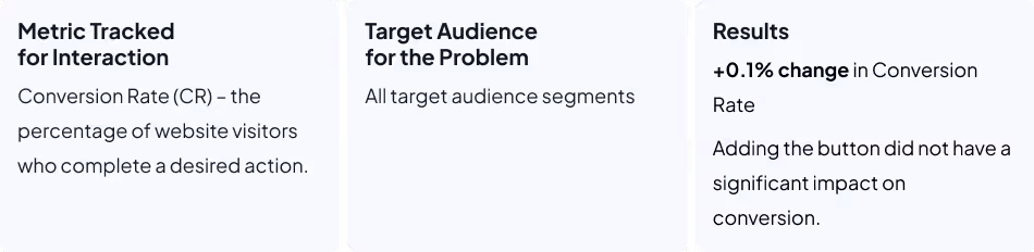
Adding “Compare” and “Favorites” buttons to the header will improve site navigation and provide quick access to products from these lists, which is expected to positively impact the Add to Cart Rate and Conversion Rate (CR).
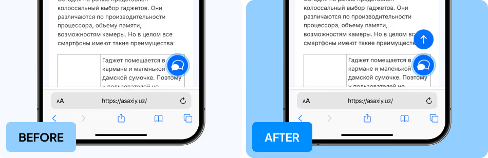
The absence of a “Back to Top” button for quickly returning to the top of the page negatively affects the user experience and, as a result, reduces the overall conversion rate.
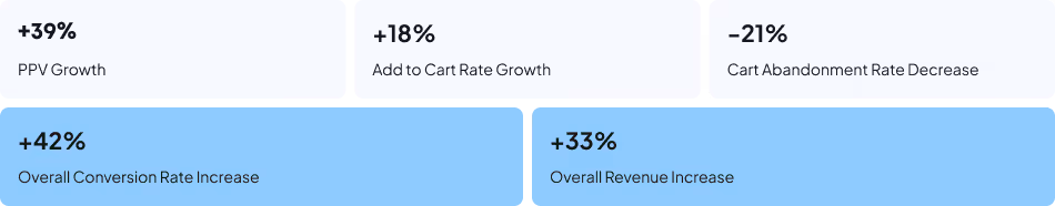
As a result of implementing the successful hypotheses, we achieved the following:
Case studies
Check out how we help companies like yours overcome challenges and rise to the next level.
.png)
Conversions
Share of Online Sales
Work Period


Revenue
Conversions
Work Period


.webp)


