Content


UX/UI Designer at Promodo
Kateryna works with a full product design workflow, including:
She also has strong expertise in:
.avif)
Users rarely behave as we expect. And the thing is that the problems hide right between intent and actual behavior. Website heatmaps help you examine this interaction in detail and see what captures attention, what causes confusion, and what remains unnoticed.
In this article, Promodo's specialists in UX&UI will explain and show how to use heatmaps to gather user behavioral data.
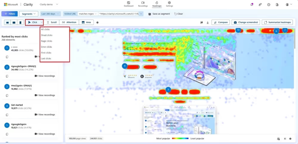
A website heatmap visualizes how users behave on a page. Think of it as an attention map that highlights exactly where people interact with your interface and which areas they ignore.
Tools like Microsoft Clarity, Hotjar, or Plerdy can help you see your interface as your users see it. Without assumptions and bias. How do these platforms do that? They track clicks, scroll depth, cursor movements, and even “rage clicks.” Then, they demonstrate clear behavioral patterns based on the gathered data.
The more people interact with an element, the “hotter” it appears on the map, with colors shifting from cool blues to vibrant reds.
When combined with traditional analytics and session recordings, heatmaps provide a comprehensive real-world view of how users truly navigate your site.
Heatmaps come in several formats, each offering a different perspective on user behavior. Together, they show how users actually use your site.
Click heatmaps pinpoint exactly where users click. This way you see which buttons are working as intended and where users try to interact with non-clickable elements. Often, click heatmaps reveal hidden hotspots that designers didn’t predict.
Scroll maps visualize how far down a page users actually scroll. This helps you evaluate the visibility of key sections, identify exactly where interest begins to drop off, and determine if critical messages or CTAs are getting lost below the fold.
The tools automatically flag behaviors that indicate user frustration, such as repeated clicks, dead clicks, or rapid back-and-forth navigation. These patterns help pinpoint UI issues or confusing layouts that require immediate attention.
Area maps visualize user engagement across specific page sections, so you see which blocks attract attention and which fail to engage.
Heatmaps are great for visualizing how people use your site, but they are only a piece of the puzzle. To see the whole picture and draw better conclusions, you need to combine them with other analytics and UX research tools.
Session recordings replay real user interactions with a page. They show how users move through content, what draws their attention, where they pause, and what causes friction.
Heatmaps show you the general trends of all users, while recordings let you zoom in on specific examples. The point is that if a heatmap shows a weird cluster of clicks in a random spot, you can watch a few recordings to see exactly what those users were trying to do. You move from "I see a problem" to "I understand why it's happening."
Quantitative analytics shows what is happening on a page: where engagement drops, which pages have high bounce rates, or when users leave the site. But numbers alone rarely explain why.
Heatmaps add the necessary context to the metrics. For example, if a page attracts strong traffic but has a low CTR or a high bounce rate, a heatmap may reveal that users focus on secondary elements rather than key CTAs. Or, it might show that your most important content is placed so far down the page that nobody ever reaches it.

Heatmaps work great when paired with surveys, reviews, or usability testing.
When a heatmap shows “cold” areas or unexpected interaction points, direct feedback can explain the reason. Maybe users didn't understand what the button did, expected a different action, or simply decided the content wasn’t relevant to them.
You can use these insights to develop a solid plan to fix the issue.
Do you want users to stay on your website? We have solutions that work.
At Promodo, we regularly use heatmaps to generate hypotheses, identify behavioral barriers, and refine user interaction scenarios.
The use cases we gathered demonstrate how heatmaps, combined with other tools, help find opportunities for growth and improve the interface to work more effectively.
The mobile funnel analysis revealed a significant drop at the "Add to Cart" stage. The ACR was 12.2% lower on mobile than on desktop, despite mobile devices accounting for 88.6% of all traffic. Since most users land directly on the product detail page, improving ACR was our top optimization priority.
Insight:
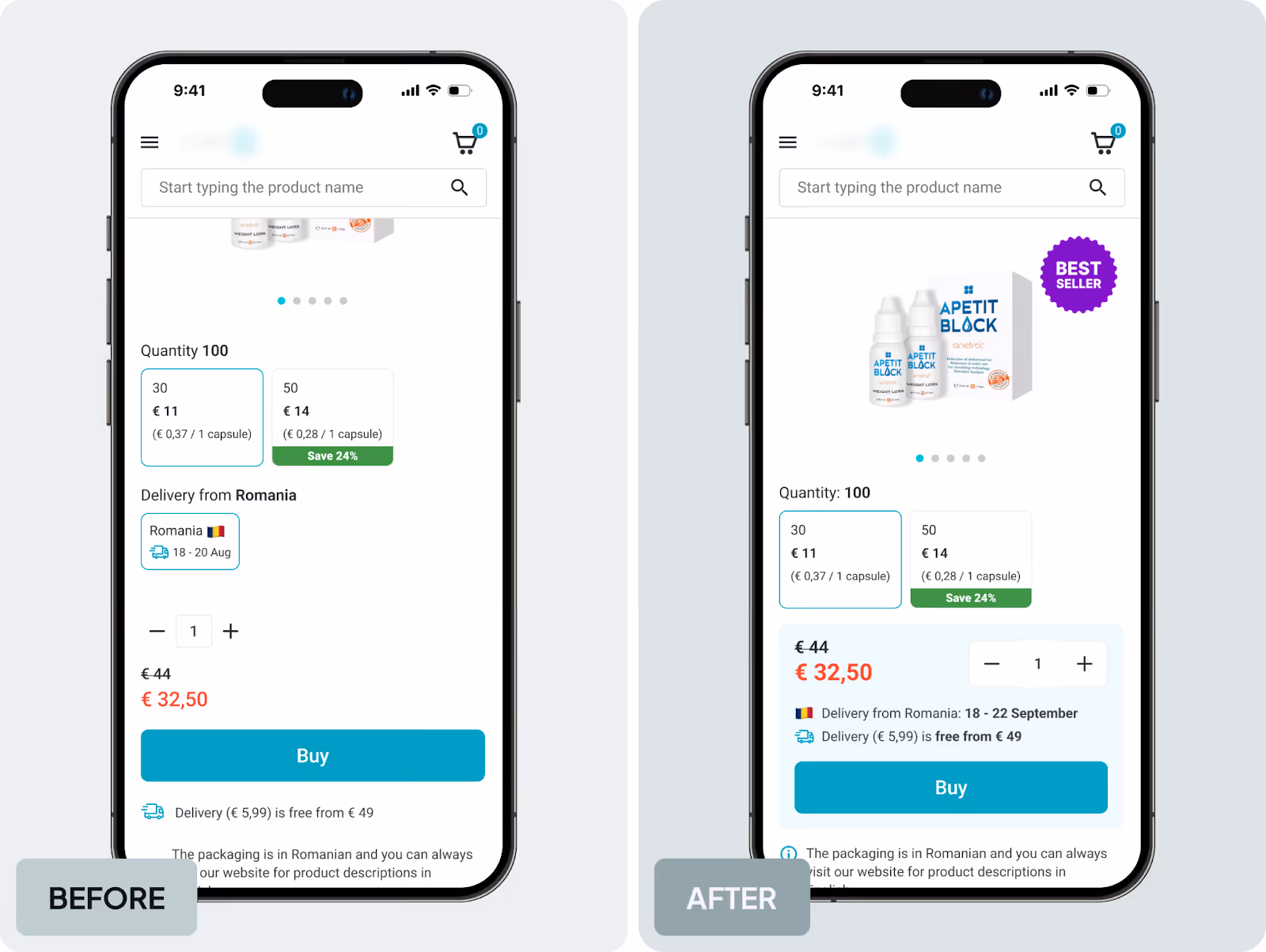
Heatmaps and session recordings showed that users repeatedly clicked the "Country" and "Delivery Date" sections, even though they weren't interactive. It created false expectations and distracted them from the main actions. We also found redundant information: the delivery country appeared three times and the date twice at the top of the page.
As a result, critical interface signals were losing their priority.
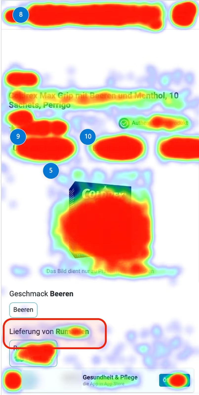
The solution: We removed duplicate info and reduced secondary elements that caused distraction. It lowered the cognitive load in a high-impact area and helped users focus on the main goal: adding the product to the cart.
GA4 data showed that on mobile devices with a screen height of up to 800 px, the click → form_start conversion rate was 2–3 times lower than on larger screens. It meant the “Subscribe” button was poorly visible to many people.
Insight:
Scroll heatmaps confirmed the issue: the CTA was positioned at 70–75% scroll depth, meaning most users never reached it. Session recordings supported this finding, showing users making a few short scrolls and leaving the page without reaching the button.
Solution:
We moved the “Subscribe” button to the first or second screen to make it visible to most users without additional scrolling. This increased CTA visibility and shortened the path to the target action for mobile users.
Heatmaps showed that the “Where to Go” section was one of the most engaging areas of the homepage, as users actively interacted with the filters. However, session recordings showed that, despite the interest, very few people clicked through to event pages.
Insight:
Usability testing explained why. Participants noted that event cards didn’t provide enough information, text in images was hard to read, and the lack of categories made it challenging to find relevant events.
Users were expected to explore events, but the section didn’t guide them further, leading to a drop in engagement.
Solution: Based on these insights, we redesigned the “Where to Go” section. We added categories and filters and made event cards more informative. This simplified event selection and made the path to event pages more intuitive.
Analytics showed that the CCR was below the benchmark, with a high percentage of users dropping off after selecting a delivery option. To identify the cause, we reviewed heatmaps, session recordings, and usability testing.
Insight:
Heatmaps revealed frequent clicks in the courier delivery area. Session recordings showed that users were looking for the address field, expecting it to be placed next to the selected delivery option. People were confused when it wasn’t there. Usability tests confirmed the issue: 67% of participants didn’t understand where to enter the address, and 50% struggled to find the fields in the dropdown menu.
Solution: To remove friction during delivery selection, we placed the address field directly inside the courier delivery block. This made the checkout clearer and more predictable for users.
Analytics showed that many users viewed job pages but didn’t click the “Apply” button.
Insight:
Session recordings in Clarity revealed a common pattern: users scrolled through the page, read the job description, scrolled back to the top, but the CTA was no longer visible when they were ready to apply.
It meant insufficient CTA visibility during active content review.
Solution: We added a sticky “Apply” button that remains visible while users scroll the job page. This reduced unnecessary actions and made it easier to apply for the position.
Heatmaps don’t provide ready-made answers, but they show user behavior as it really is. When we combine them with analytics, session recordings, and qualitative research, we find where an interface performs well and where it creates obstacles.
That’s why heatmaps are a key part of a systematic UX approach. They help create strong hypotheses and build interfaces that work better for businesses and feel clearer for users.

UX/UI Designer at Promodo
Kateryna works with a full product design workflow, including:
She also has strong expertise in:
You may also like
Choose quality and trusted services to improve the presence of your company on the Internet, and feel free to contact our UK team if you have any questions.

Magento is the world leader in the segment of open source e-commerce solutions.

Our featured SEO article explains evidence-proven ways to optimize your real estate website.
.png)
Despite the undeniable results that come from PPC, studies keep showing that people still have more trust in organic results.
We at Promodo are ready to help you improve your performance across all digital marketing channels.
Get started


.avif)