Content


Content Marketing Manager

Head of UX/UI Promodo
I have over 8 years of experience in designing CRM and HRM systems, eCommerce, landing pages, and mobile applications. As a UX/UI designer, I develop strategies and innovative design solutions that help improve user experience and result in positive changes in key business metrics. As a mentor, I teach new designers how to create innovative and well-reasoned design solutions, share my experience, and help them avoid mistakes in interface design.
.avif)
You’ve built a website and maxed out your ad budget, but sales are still low? This might be a design issue.
Together with Promodo experts, we have prepared a rating of non-obvious UX/UI mistakes that directly impact conversions. We regularly see these mistakes when conducting UX audits for clients from various niches, so all conclusions are based on practical experience.
UX (user experience) is about how quickly and effortlessly a customer can perform a target action: find a product, add it to the cart, place an order.
UI (user interface) is a visual shell that can either help or hinder this process.
Many companies invest in expensive designs, but their websites still don't perform to their fullest potential. The reason is simple: users may find them beautiful, but inconvenient. They get lost in the menu, don't notice the key buttons, or spend too much time searching for the right product. As a result, the business loses part of its advertising budget and potential customers.
For example, the “Add to cart” button blends into the background. It may seem like a minor detail, but it directly affects web design conversion: the less noticeable the button is, the less often it is clicked, which means a loss of sales every day.
In digital marketing, systematic work with such details is called CRO (Conversion Rate Optimization). It's all about how to make the design work for business indicators: applications, sales, and revenue.
If you recognize at least one of the mistakes from the list below, it may be time to reconsider your approach to website design.
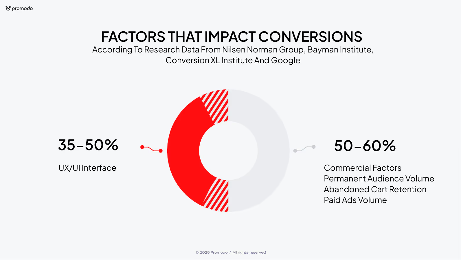
The menu is the first point of contact between the user and the website. If it is inconvenient, the visitor gets lost right from the start and simply leaves the website. This is especially true for mobile devices, as more than 60% of global traffic today comes from smartphones (StatCounter). This means that the mobile experience should be a priority.
For example, it is important to remember that most people interact with the website using their thumb. Therefore, key elements should be located so that they are easy to reach. If important buttons or links are at the top of the screen, they become virtually “unreachable” and work much worse on mobile than on desktop.
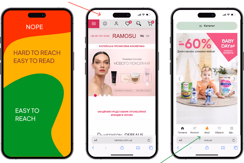
Check where the menu is located on your website.
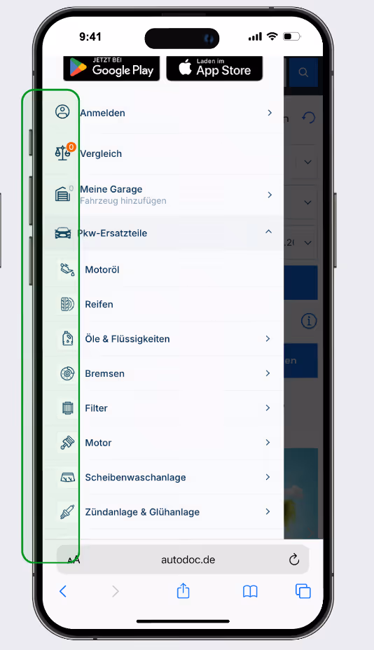
Another critical factor is the lack of visual cues in the menu. People perceive icons faster than text. When navigation consists only of words, it is more difficult for users to navigate, especially during their first visit. This increases the time it takes to find the desired category and reduces the CTR on the menu.
Icons in the navigation menu help users perceive information faster, especially during their first visit to the site. Without visual cues, it is more difficult for visitors to identify categories by name, which complicates the search for the right products. This can reduce interest and lead to fewer clicks on categories.
Anton Chebotarenko
Head of UX/UI at Promodo
Solution: Make the menu intuitive. Add clear icons next to categories, place key elements within thumb reach, and simplify navigation.
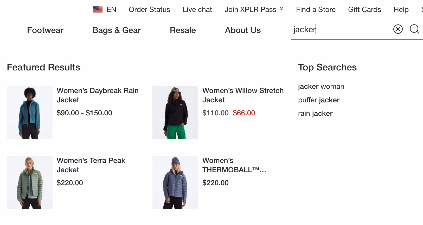
Search in eCommerce should work under real-life usage scenarios. Users do not always enter perfectly accurate names and often make spelling mistakes. If this prevents a person from finding a product, web design conversion does not occur.
Another common problem is the lack of autocomplete and filters in the results. In this case, the search is delayed: the user spends more time refining the query instead of quickly going to the desired product.
According to the Baymard Institute, 41% of eCommerce sites do not support basic search scenarios (the 8 key types of queries that users perform most often). This means that almost half of online stores are losing sales.
Implement “smart search” that recognizes typos, transliteration, layout changes, and immediately offers category options or result filtering. This shortens the path to the product and directly affects the number of Product Page Views.
If the products on the home page are selected without taking into account the user's browsing history, it becomes less relevant, and PPV and CR metrics do not grow.
Add blocks such as “You viewed earlier,” “Recommended products,” or “Just for you.” This increases the likelihood of users navigating deeper into the site and encourages purchases.
In the product listing, users constantly refine their search parameters: size, color, price, or brand. If the “Filters” button is not fixed and disappears when scrolling, each change requires returning to the top of the page. This creates unnecessary steps, slows down the selection process, and reduces the likelihood of going to the product page.
Fixing the button makes the process convenient: the user can adjust the parameters at any time and find the relevant result faster, which has a positive effect on conversion:
Here you can scroll and filter at the same time — everything is convenient and fixed.
This is where we spend most of our time making purchasing decisions. Every element of the page will influence this decision. Check your product pages for the following omissions:
If the button disappears when scrolling, the user does not see the CTA. This directly reduces the Add to Cart Rate. When the user scrolls down the page, the button should stay in place.
Customers want to know right away how much delivery costs and when they'll get their stuff. If this info only shows up at checkout, some users will ditch their cart.
When buyers are not shown the discount amount, they do not feel the real benefit of the purchase. This reduces their motivation to add the item to their cart.
Displaying the new and old prices, as well as the amount saved, allows buyers to clearly assess the benefit, which increases their motivation to buy. This has a positive effect on ACR, as users are more likely to add an item to their cart when they see real savings.
Anton Chebotarenko
Head of UX/UI at Promodo
A countdown timer on promotional items encourages faster decisions. If there is no timer, the user might postpone the purchase.
The shopping cart is another opportunity to increase sales. Check that you are not missing out on these opportunities due to:
Are customers abandoning their shopping carts before checkout? Let's fix that.
Checkout is the most critical stage. And here, any unnecessary friction costs money.
The golden rule of conversion at checkout is to minimize the ways to exit it so that the user is focused on filling out the form. The presence of navigation elements (both on desktop and mobile) on the order page allows the user to leave the page, which reduces conversion at this stage.
Anton Chebotarenko
Head of UX/UI at Promodo
Also, make sure that the data in the form does not disappear after reloading the page. Having to re-enter data is annoying and causes many users to leave the site.
An additional barrier is authorization only via email. It is easier for some customers to enter their phone number and receive a confirmation code. When the registration process is complicated, some potential orders are lost.
Content marketing is a powerful traffic channel. But if the blog does not contain product recommendations, visitors read articles and leave immediately. As a result, valuable traffic is not converted into sales.
Users come to the blog to read tips or reviews. But if they don't find any offers to buy a product, they leave the article without taking any conversion action.
Anton Chebotarenko
Head of UX/UI at Promodo
Add simple integrated blocks with products that match the topic of the material to help retain the user and move them further down the funnel.
When it comes to design, it's better not to experiment blindly. At Promodo, we rely on global best practices and constant A/B testing of hypotheses.
Of course, we are in favor of doing things right from the start.
An example is the HR website we created for the Aurora chain of stores. We created a design that solved a specific business problem: attracting talent. To do this, we implemented personalized search, convenient filters, left forms for filling in data on each page and clear CTAs, and helped our client develop their employer brand.

But even if the site is already up and running, but conversion is “sinking,” a redesign and other UX design hacks to improve website conversions
.
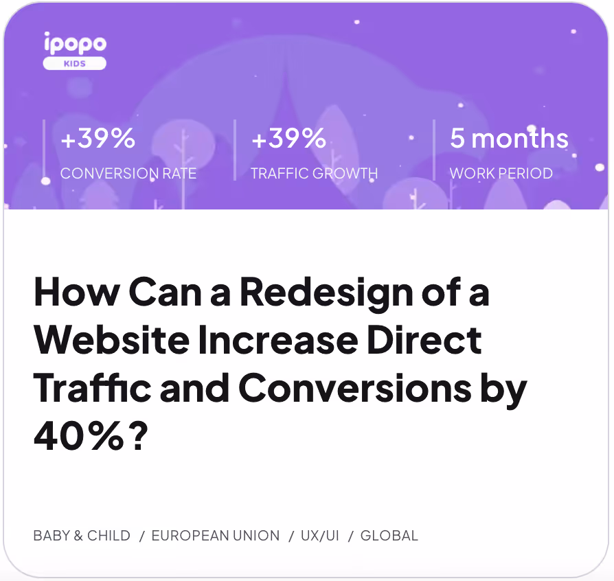
For our client Ipopo, the redesign allowed us to significantly increase key metrics: direct traffic increased by 39%, and conversion to orders — by 32%. This was made possible by several elements that work together to increase conversion and customer loyalty.
If your website looks good but doesn't sell, it's a sign that changes are needed.
At Promodo, we will help you conduct an audit, find weak spots, and turn your design into a real tool for increasing conversion.

Content Marketing Manager
Head of UX/UI Promodo
I have over 8 years of experience in designing CRM and HRM systems, eCommerce, landing pages, and mobile applications. As a UX/UI designer, I develop strategies and innovative design solutions that help improve user experience and result in positive changes in key business metrics. As a mentor, I teach new designers how to create innovative and well-reasoned design solutions, share my experience, and help them avoid mistakes in interface design.
You may also like
Choose quality and trusted services to improve the presence of your company on the Internet, and feel free to contact our UK team if you have any questions.
Marketing solutions aren’t cheap, so relying only on intuition isn’t an option. Every strategy must be driven by data.

In this article, the Promodo team will explain step by step how to set up SEO promotion of an online store: from technical SEO audit to optimization of content.

Using a pay-per-click campaign brings in high-quality leads for financial institutions and boosts the return on investment for your marketing efforts.
We at Promodo are ready to help you improve your performance across all digital marketing channels.
Get started